Born in London, Riding the World
Our Journey
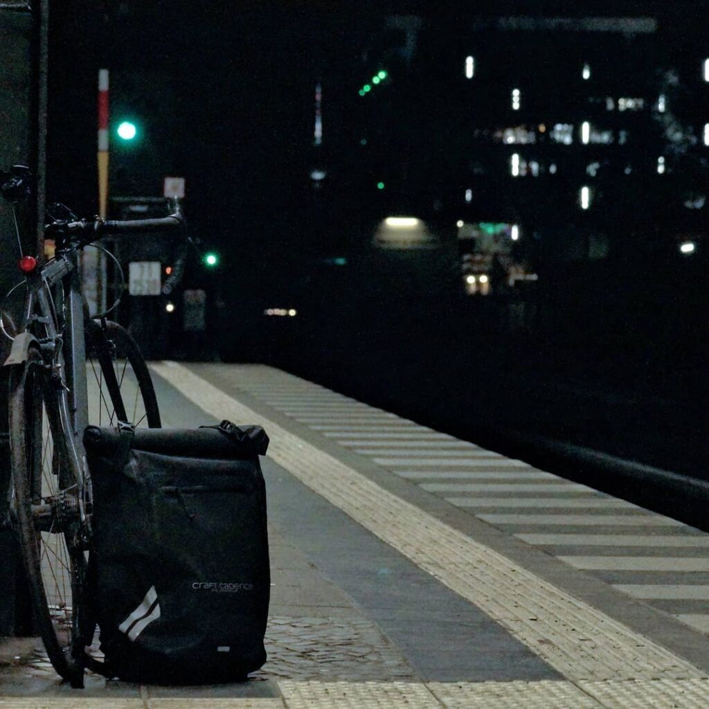
Craft Cadence was born in the heart of London’s bustling streets, where cycling isn’t just a commute, but an obsession.
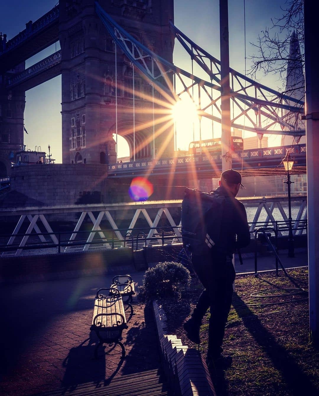
As we’ve grown, so has our vision, expanding from our UK roots to our presence in California, US. Today, we serve cyclists from all over the world with our international hub and partner network.
A Global Team, United by Cycling
Innovation, Built by Riders
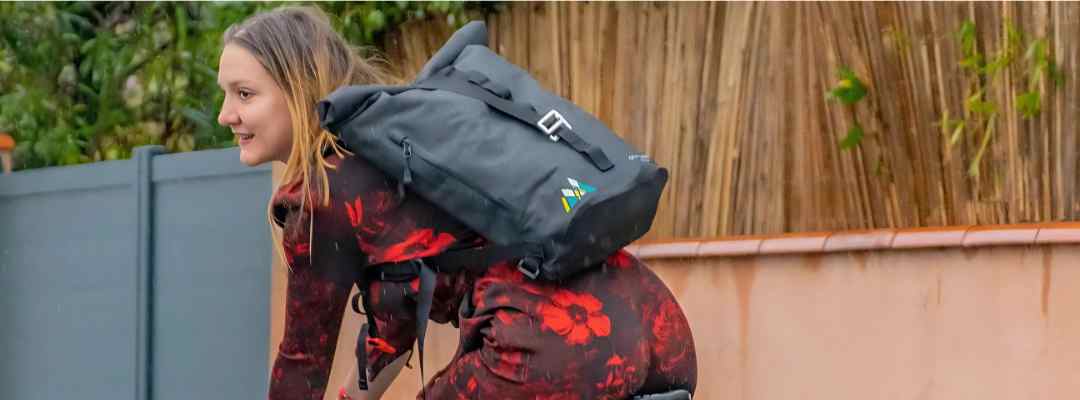
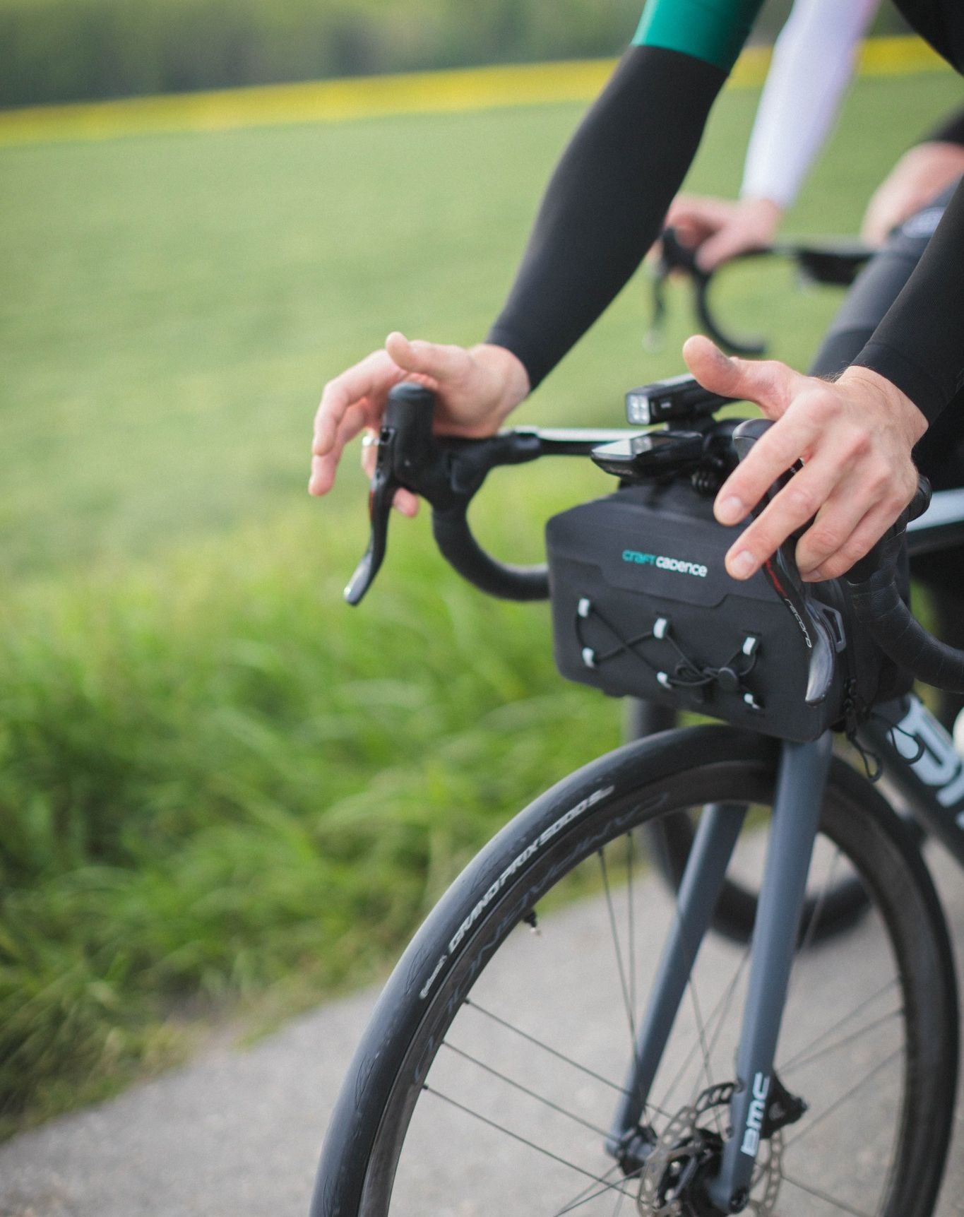
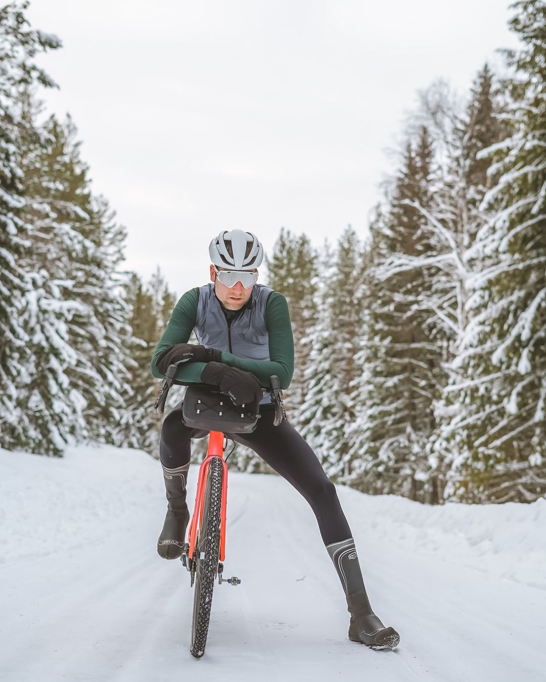
At Craft Cadence, design is personal. Our products are born from the feedback and ideas of our community. Whether it’s waterproof bags or accessories, we build with the needs of cyclists in mind, combining modern materials with time-tested designs. Your ride fuels our innovation.
Building a community
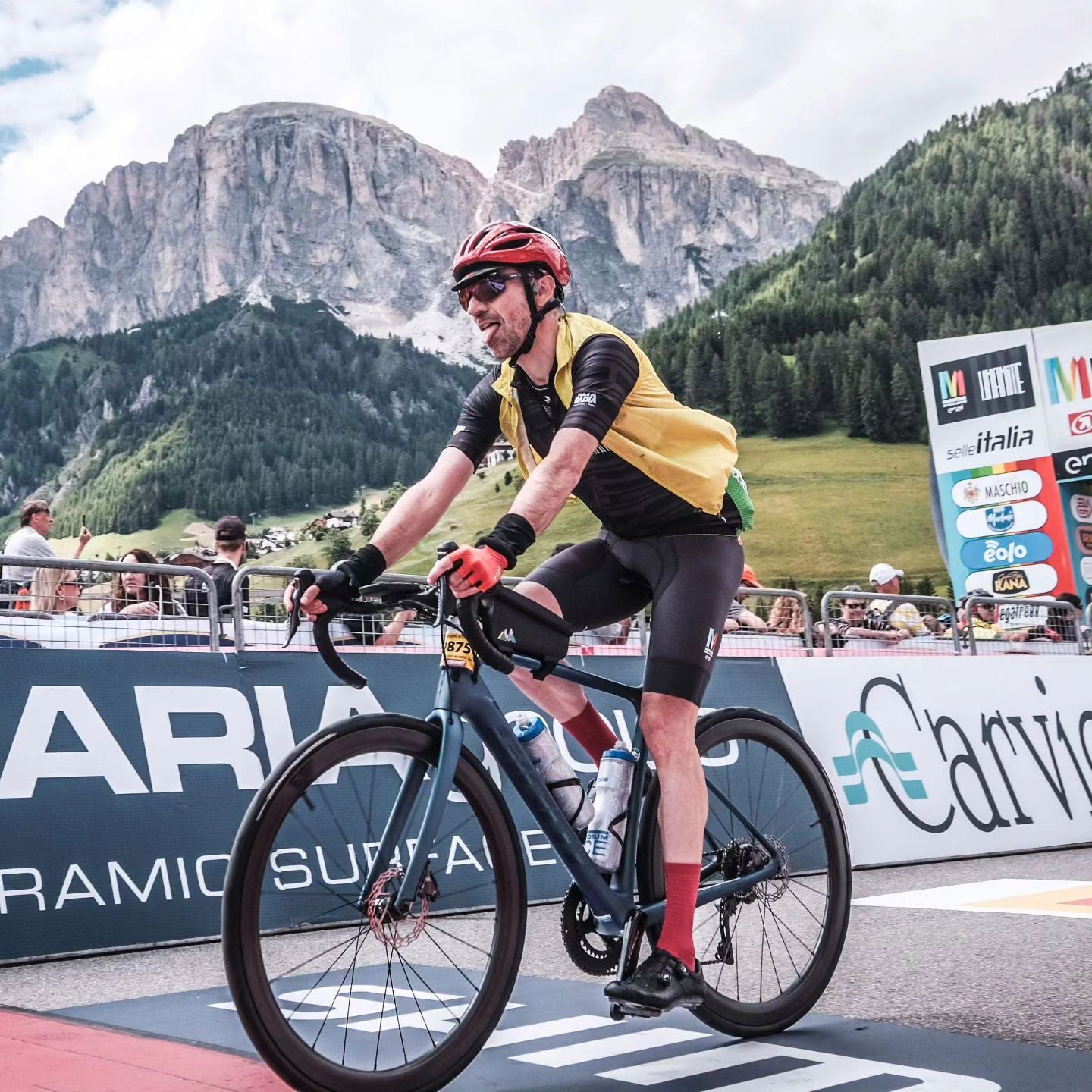
We believe every cyclist has an extraordinary story. From everyday commuters to adventurers, we equip riders with the gear they need to achieve their goals.
We support competitive amateur cylists with kit and sponsorship in order for them to fulfill and realise their epic adventures and challenges.
Giving Back
We believe in making cycling accessible to all. That’s why we partner with organisations to improve cycling infrastructure, enable access to bicycles, and to reduce reliance on fossil fuels and single use products. Full list of our partner organisations can be found in our Sustainability page.
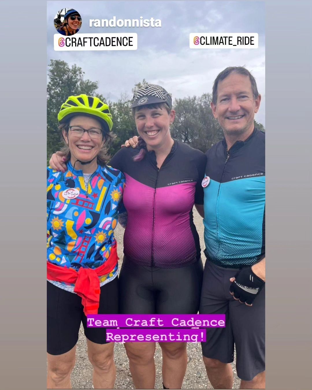
Climate Ride
Partnering with Climate Ride, we put together a team of amateur cyclists riding for charity, sponsoring them with contributions and kit.
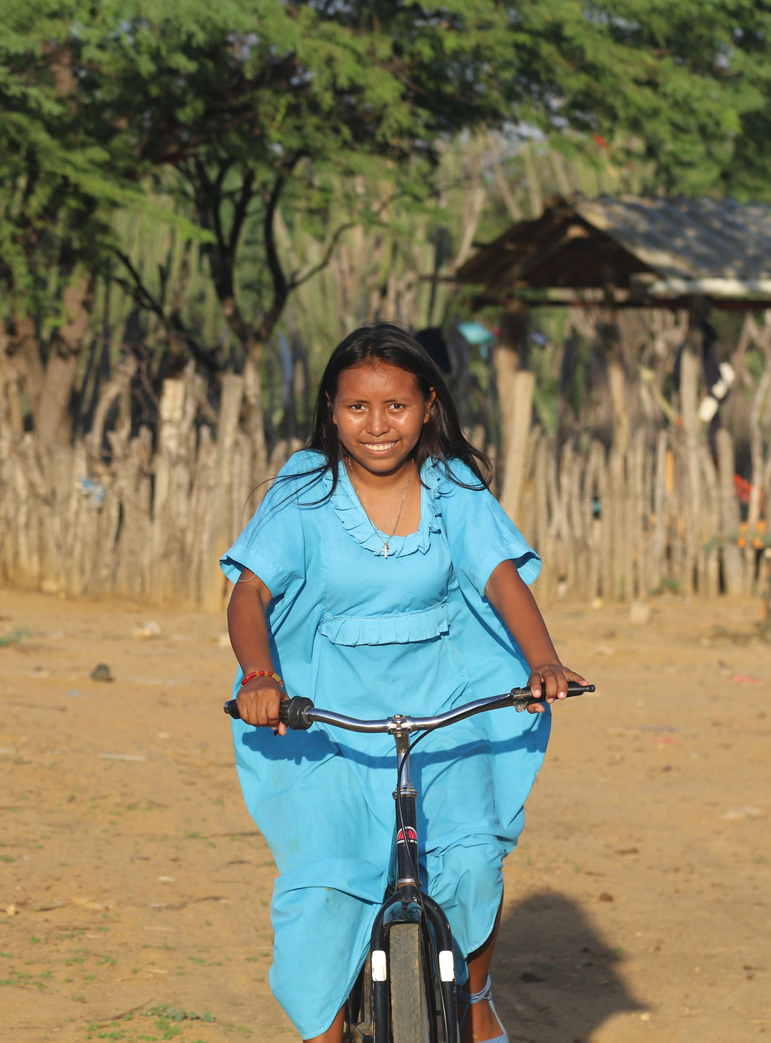
World Bicycle Relief
We donate annually to World Bicycle Relief organisation to provide access to bicycles as a vital form of transportation for developing communities.
Sustrans and Bikepacking Roots
We partner with Sustrans in the UK and Bikepacking Roots in the US, supporting them to maintain existing cycling infrastructure and advocate for more safe cycling routes.
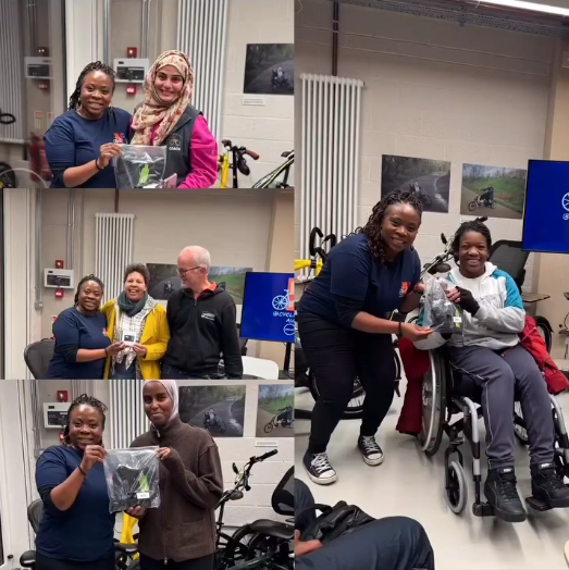
Supporting grassroot initiatives
Ever year, we support local organisations, cycling clubs and individuals that do great work in their local communities. Shout out to Rose from @cyclistnextdoor who promotes cycling in her local community in London and Bingley Velos from West Yorkshire who raise money every year for the UK Ambulance service.
Pushing Boundaries Sustainably
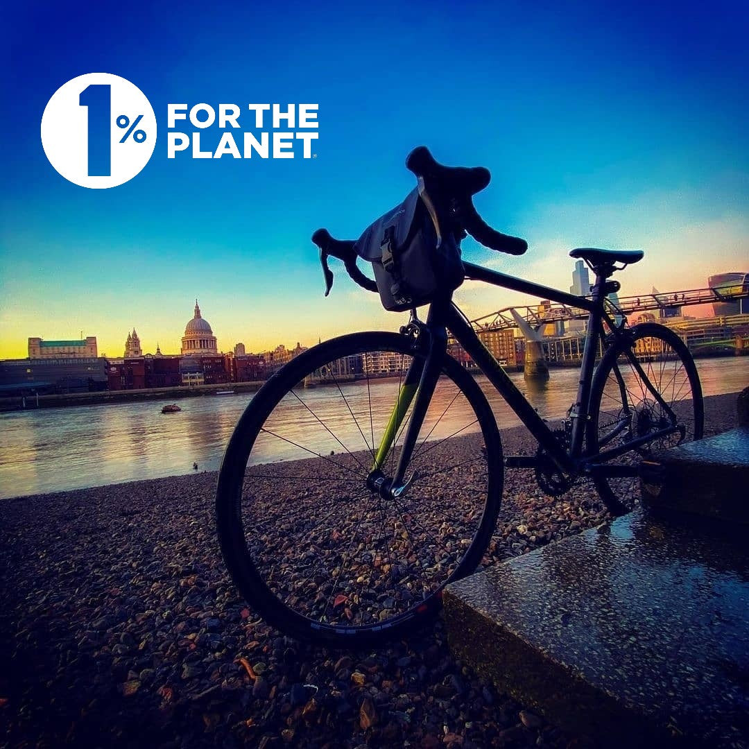
We know there are issues more important than us. Sustainability is part of our everyday thinking, from use of recycled materials in our products to our take-back scheme. To broaden our impact, we are proud members of the 1% For The Planet Initiative, where we donate a portion of revenue to vetted environmental organisations.
OUR ETHOS
Our logo is based on a geometric pattern that speaks to us in three ways:
- A city map like effect, representing our community commuting or just riding bikes in cities around the world. The shapes also remind us of our our city skyline.
- Mountains, representing us experiencing nature and challenging ourselves on our weekends and days off.
- Reflectives colour schemes of yellow, silver and teal, representing our emphasis on visibility in the dark.
Corporate stuff
Company Name: Craft Cadence
Legal Name: Renai Ltd.
UK Companies House No.: 10736148
Year Founded: 2017
Address: 76 Commercial Wharf, London E14 7HU
Contact email: info@craftcadence.com